AEM Style System
Style system is a kind of authoring which provides us the flexibility to author CSS style as part of the component for changing its style, look and feel.
There is no need to overlay or override component to implement style system. We can define CSS styles as part of component policy in page template.
The Style System provides a unified solution to both the template author’s and content author’s requirements:
- Template authors can define style classes in the content policy of components.
- Content authors can then select these classes from a drop-down when editing the component on a page in order to apply the corresponding styles.
Life without Style System
In traditional way ,it will require number of changes if we don’t have style system readily available to change the look and feel.
It will require below customization in code to achieve same feature what style system provides.
- Overlay or override component
- Override dialog to select have style option as part of the component.
- Update html code to have these styles as part of it.
- It may also require to update sling model, use or Java class to populate authored value separate by space.
Style System Implementation
Follow below steps to implement style system in AEM:
- Create button component and paste below code as part of button.html
<style>
    .margin-10 {
        margin-left: 10px;
    }
    .margin-100 {
        margin-left: 100px;
    }
    .color-red button{
        color:red;
    }
    .background-yellow button {
        background: yellow;
    }
</style>
<button type="button">Click Me!</button>
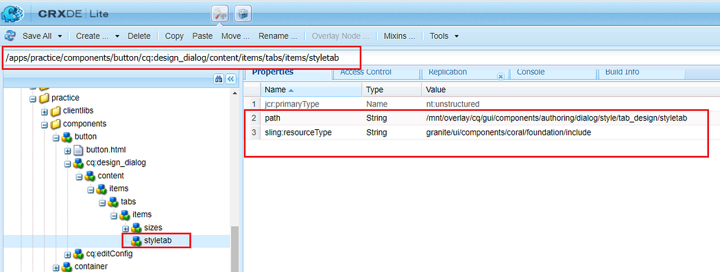
2. button component must to have “cq:design_dialog” node having highlighted “styletab” to play with or having style authoring option.
In order for a component to work with AEM’s Style System and show the style tab in its design dialog, the component developer must include the style tab with the following settings on the component:
path = "/mnt/overlay/cq/gui/components/authoring/dialog/style/tab_design/styletab"sling:resourceType = "granite/ui/components/coral/foundation/include"
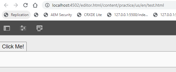
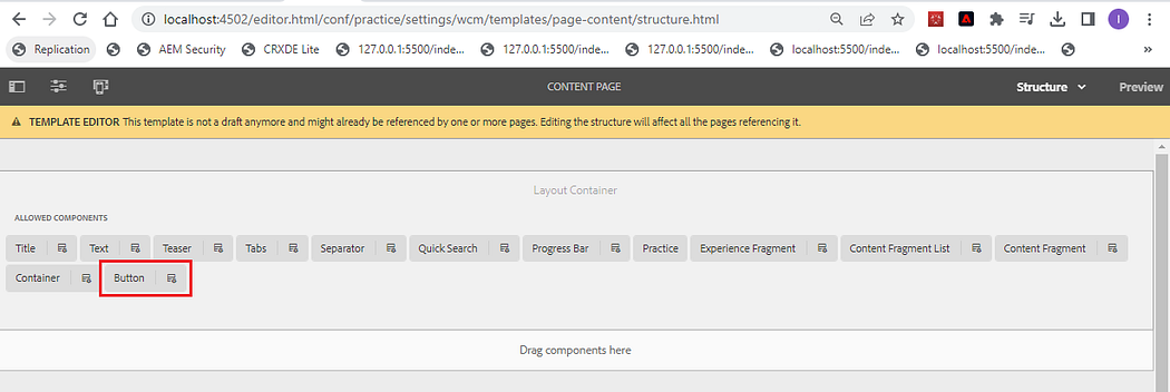
3. Create a page, drag and drop button or any available component on the page. For this blog, we are drag drop button component and authored the same.
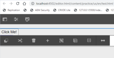
4. As part of component authoring we are seeing below available options.
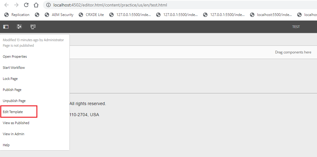
5. Clicking on below highlighted Edit Template option with open page template to author style.
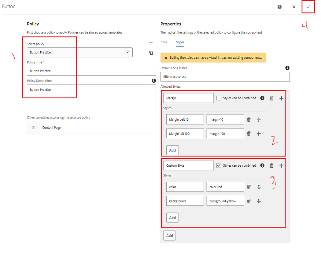
6. On page template, select highlighted policy icon on the right side of button component highlighted below.
7. Click on style tab, author Allowed styles as shown below. Style can be combined option helps us to author multiple style from the same group.
Provide policy title and description.
Click on save button.
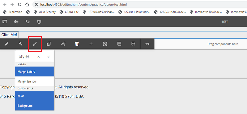
8. Select below highlighted option to apply style as part of button component.
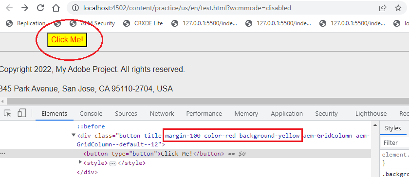
9. After selecting style will give below output having margin left as 100px, button background color as yellow and button text color as red.
10. Styles will get save as part of multifield under cq:styleIds property.
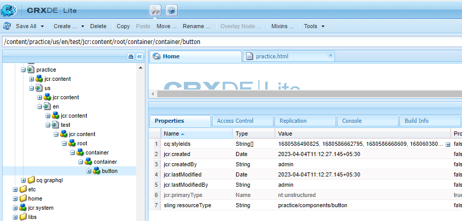
Note: Created policies for button component gets save under below node:
Policies related to button or any other component will get refer using cq:policy property as practice/components/button/policy_1680586467875
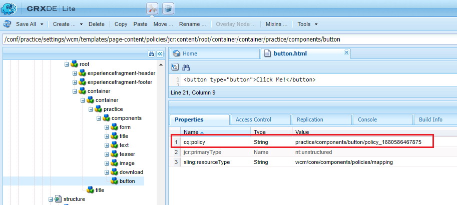
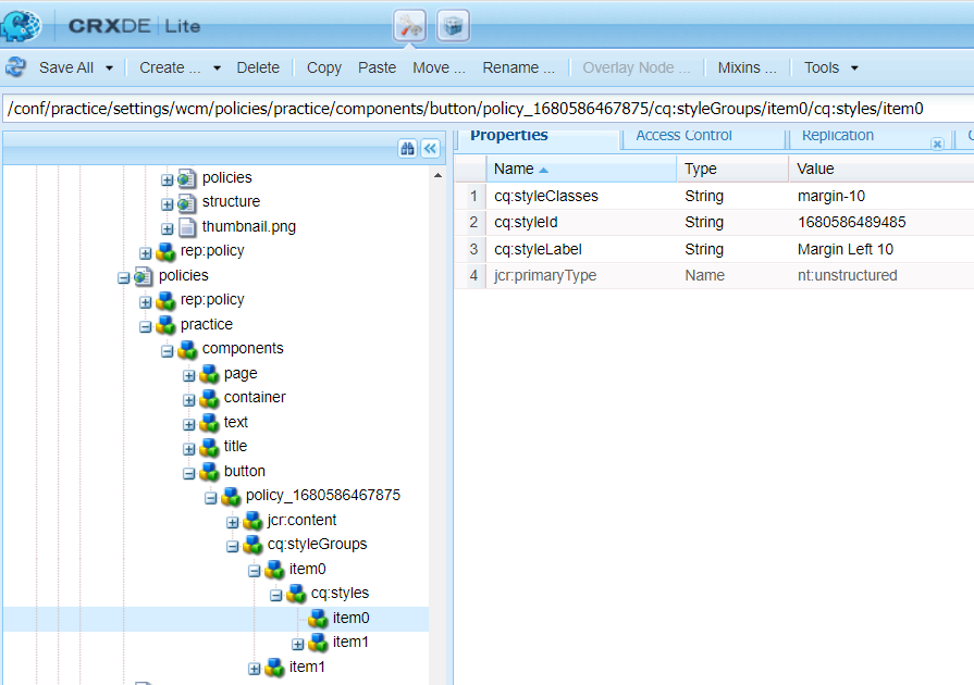
Below is the policy node which button component is referring to:
/conf/practice/settings/wcm/policies/practice/components/button/policy_1680586467875/cq:styleGroups/item0/cq:styles/item0

Imran Khan, Adobe Community Advisor, certified AEM developer and Java Geek, is an experienced AEM developer with over 12 years of expertise in designing and implementing robust web applications. He leverages Adobe Experience Manager, Analytics, and Target to create dynamic digital experiences. Imran possesses extensive expertise in J2EE, Sightly, Struts 2.0, Spring, Hibernate, JPA, React, HTML, jQuery, and JavaScript.